menu
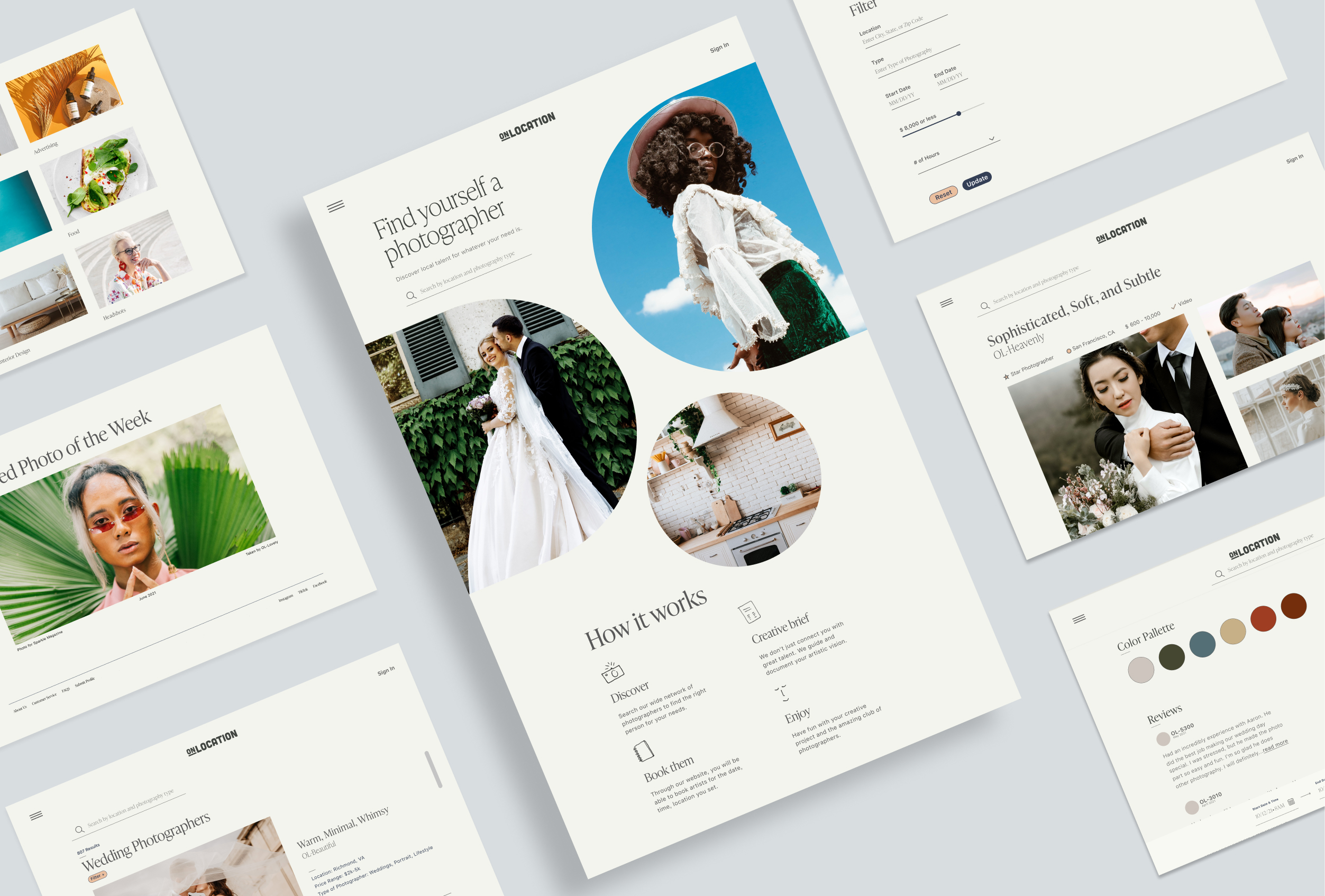
For this passion project, I built a brand and website for this faux business—OnLocation. OnLocation is an online marketplace to book photographers for business or personal needs.


When I came up with this made-up Airbnb for photographers, I needed to start with the name. A name that could help develop its brand identity. I wanted to avoid words that were too on the nose but needed something memorable and informative.
First, I started with: "book-a-shoot, f-stop, photo base." These were not bad, but it was missing warmth and whimsy (something I wanted to communicate). I brainstormed ideas with fellow designers and we asked ourselves the question: "what do photographers do?". They scout. They direct people. They use a camera and camera bag. They edit. They go onsite. We leaned into the "go onsite" and began coming up with terms associated with it until we landed on: "On Location."
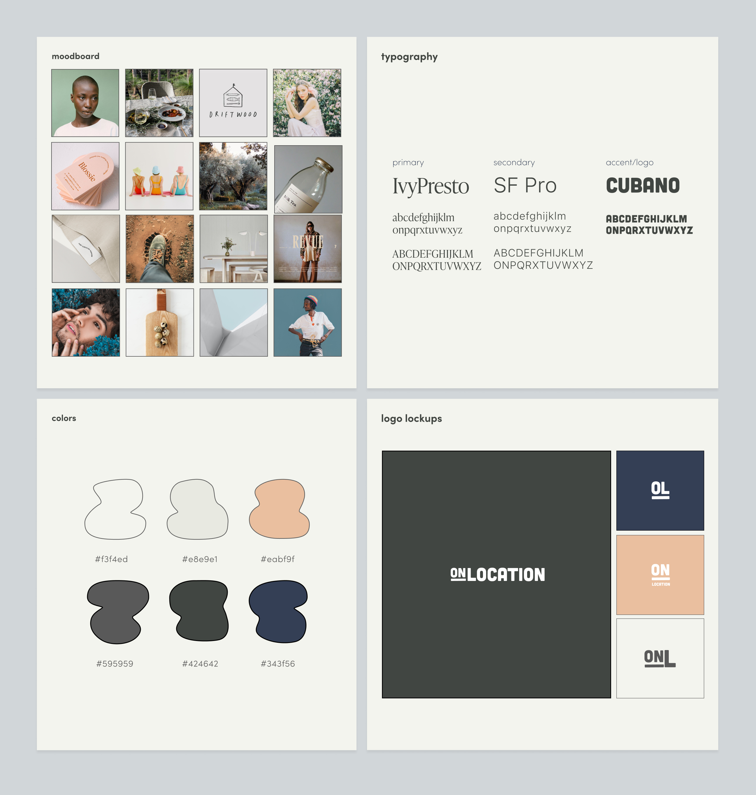
Then the brand development started. I wrote down things that came to mind when I thought of "On Location." Words like organic, nature, studio, landscapes came up. The logo could reflect that: I chose a typeface that had these soft, imperfect edges to them, like a rock or a tree—elements a photographer might interact with during an outdoor photoshoot. This natural theme (in addition to the assumed target audience) also played a role in decisions for the color palette, brand distinctiveness, typefaces, and elements.

My goals for this website was to provide an easy-to-use platform and a visually neutral space where the photography could shine in a big way. I began with wireframes for the mobile experience. Then I sketched the desktop on a 12-column grid. Instead of the default shapes photos are displayed in, I thought of varying and interesting ways to share the first image. I thought of weddings and how they are sometimes taken place in churches or old buildings. As I visualized the shapes found in that architecture, I landed on an arched shape to allude to that space. The rest of the website is very utilitarian—making sure each page flows and has easily accessible CTA's. It's simple, elegant, but user-friendly.