menu
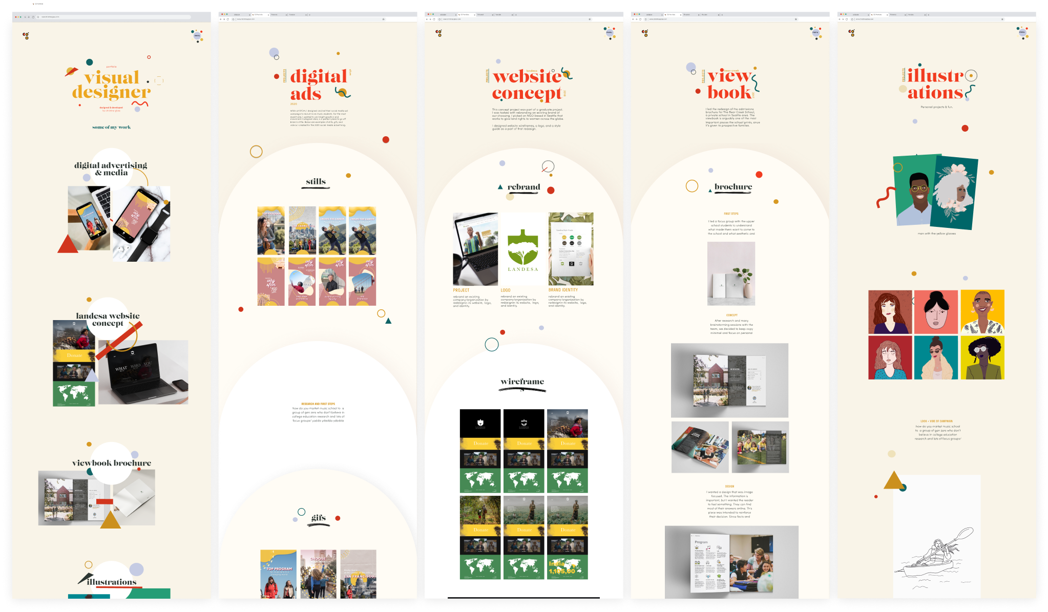
As I fully transitioned my career into graphic design, I knew I wanted to present my work in a dynamic, fully customized way. Besides the typefaces, everything on this website is built and designed by me, including the code to develop the site. Before putting together the wireframes, I took a step back, and I asked myself what defines me as a designer. What is my brand...?

I asked myself a series of questions to help understand who I am as a brand and as a designer, and in turn, helped shape decisions about color, typefaces, and layout.
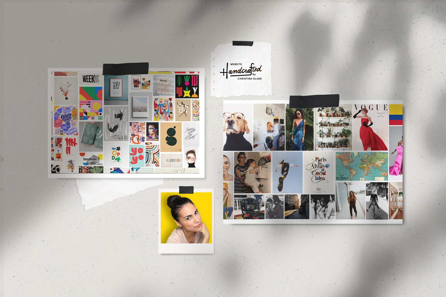
Collages always help me establish a vibe for design projects. So I put together two mood boards to visually describe my personality and my aesthetic. You may recognize works from Alvin Lustig, Paul Rand, Lauri Johnston, and Peter Saville.
Once I finished the mood boards, I started to look at color combinations and the emotions they conveyed. Once I decided on a pallette, I had to figure out a base and which colors I needed to change for accessibility purposes.

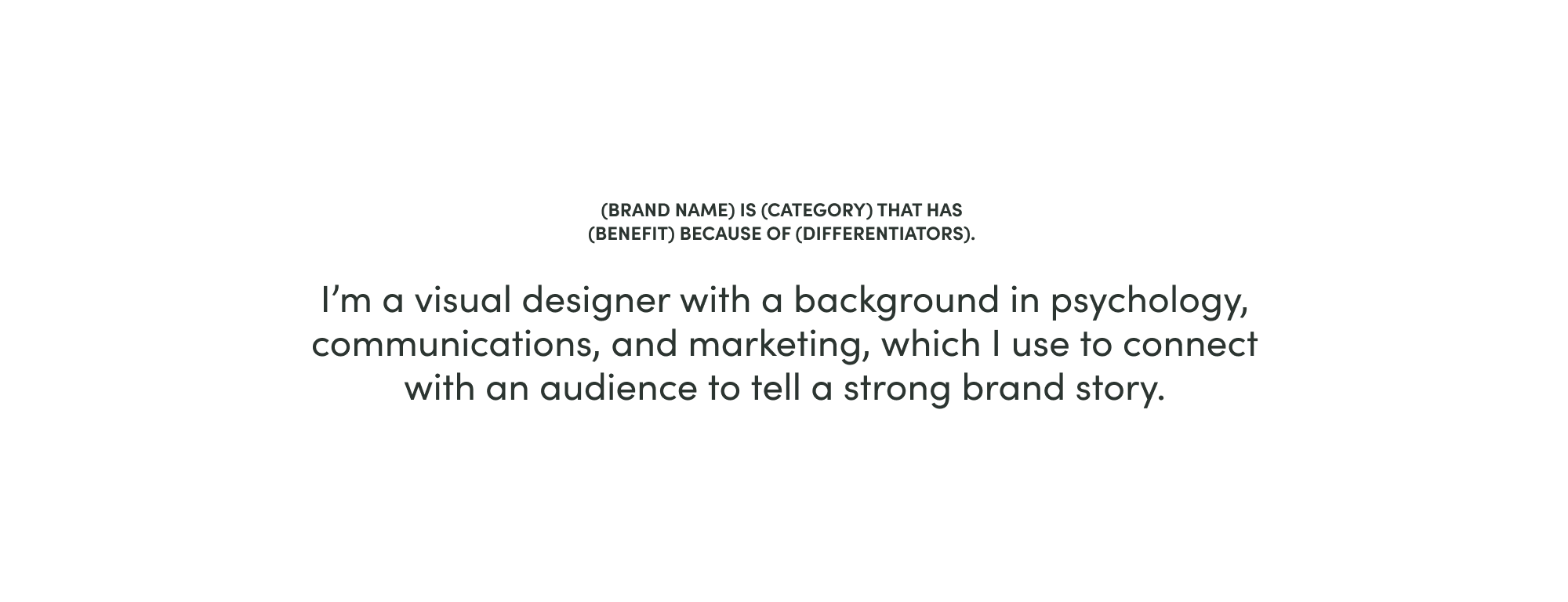
Once I determined the distinctives of my brand and my abilities as a designer, I built a statement that would help direct many of my design choices.
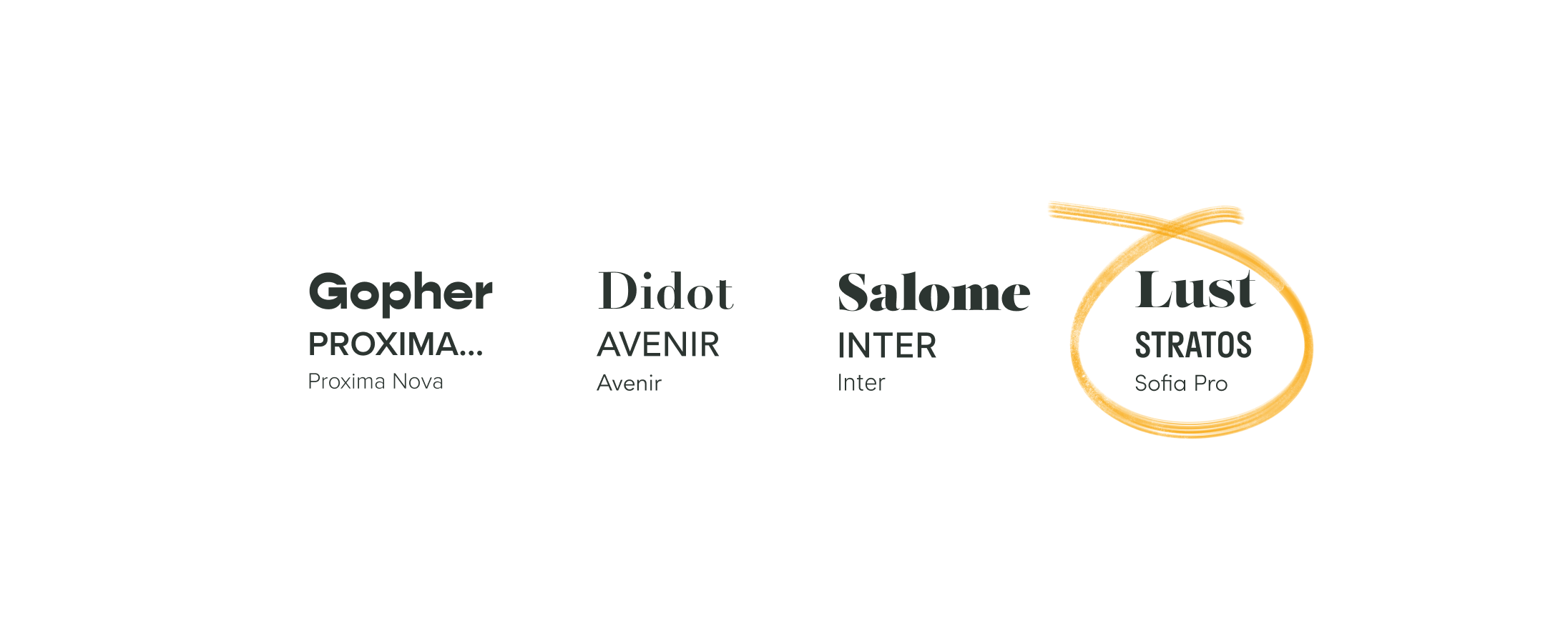
How do you combine: unconventional but classic, kind of messy but organized, friendly but sophisicated? Selecting the typefaces for my website took some time, because I believe it says a lot about a persona. Below are the different options I considered, before landing on the Lust + Stratos + Sofia set.
In the early stages of building my logo, I played with literal depictions of my last name, "Glass," such as glass cups and eye glasses. Then I explored more abstract concepts, like the french word "glace" (pronounced "glass") which means ice cream. I thought it was a nice hommage to the incredible year I spent living in Paris.
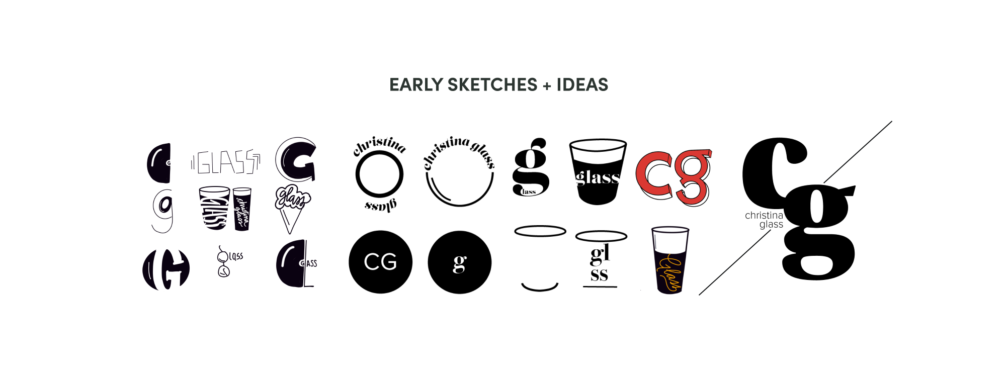
I decided to go simple and use a lettermark. When I was younger, some people referred to me by my initials, "cg." It felt endearing, and it gives a gentle nod to the youthfulness I still hold onto in my personal life and in my designs.
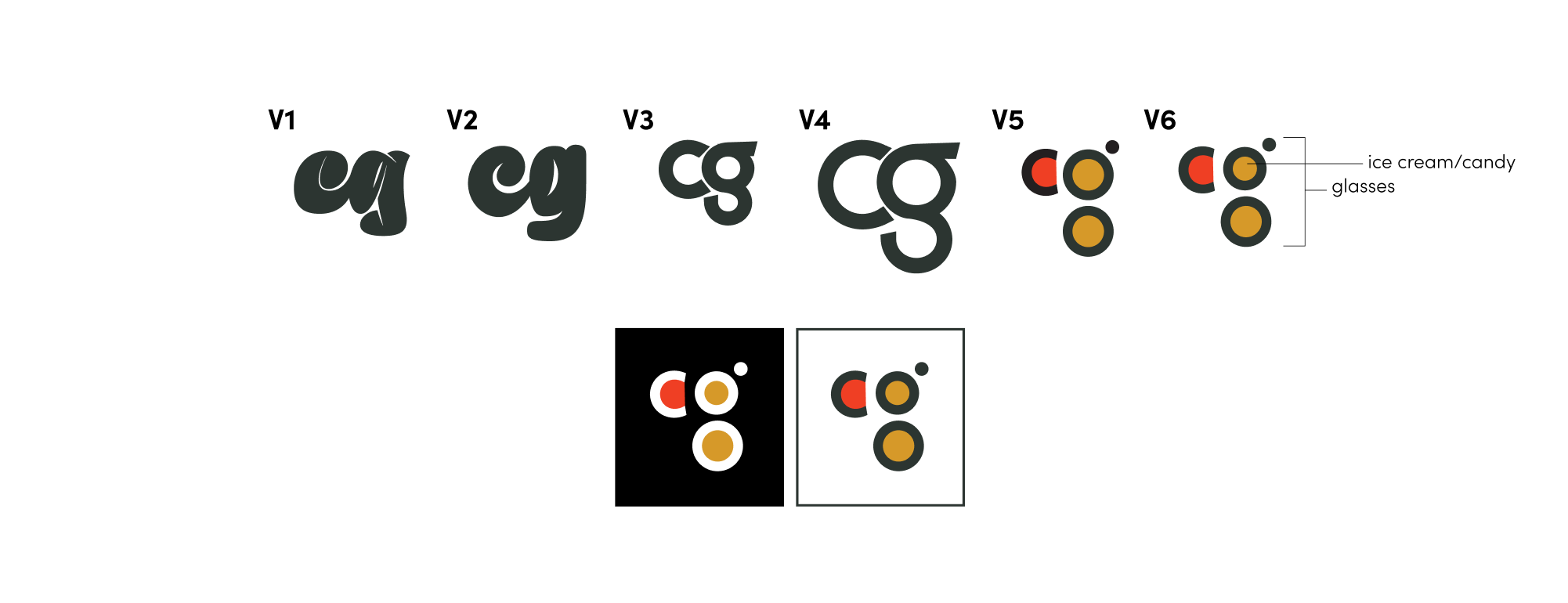
Instead of simply typing the letters out in a nice typeface, I wanted to give it some fun, and still pull from my original ideas. The colorful circles resembles candy or ice cream and the g looks like eye glasses. It gave way to the rest of the design, which uses lines and colorful shapes. It almost looks Mondrian-esque or reminiscent of Bauhaus, which makes me happy.

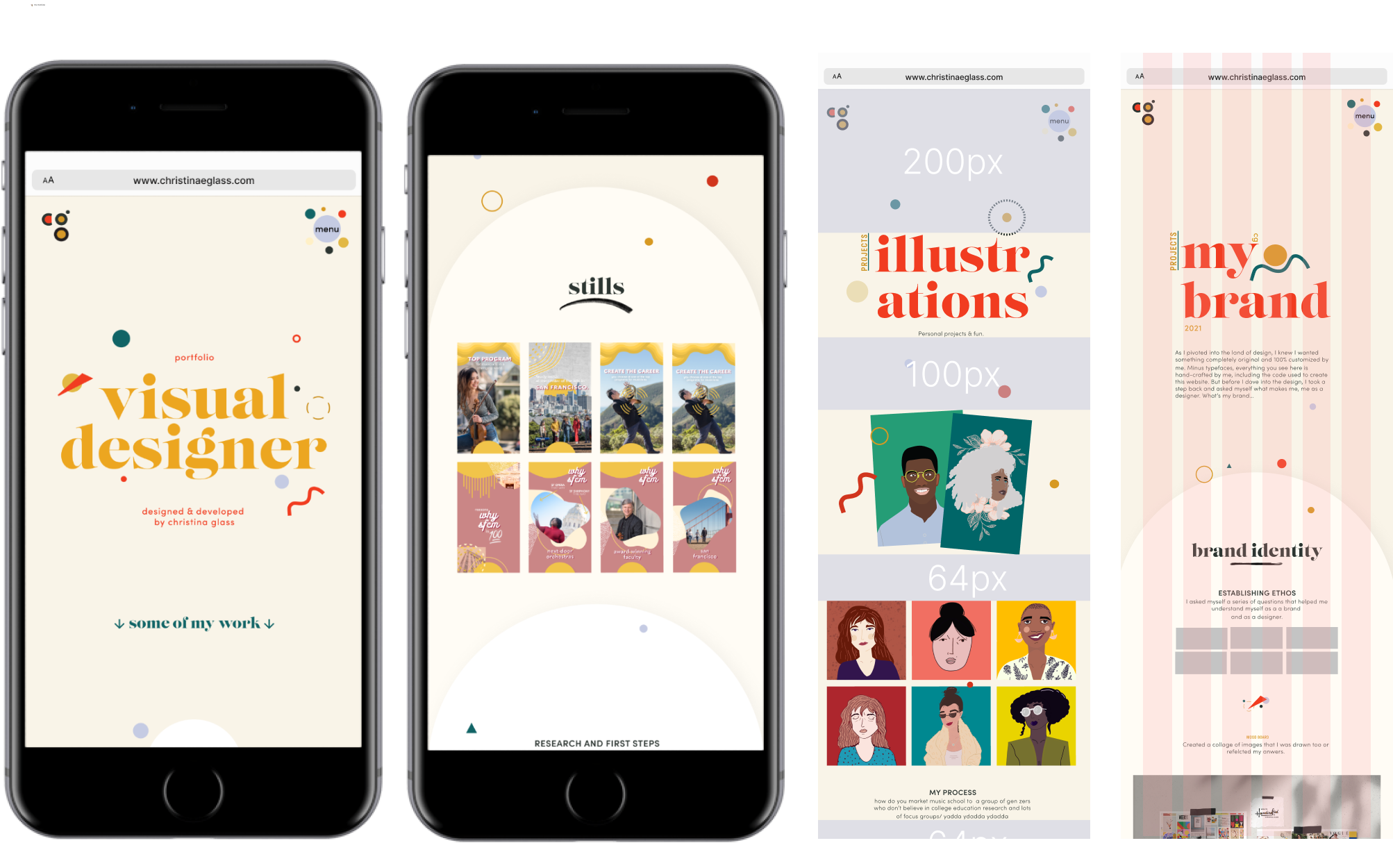
I designed the website on 12-column grid for desktop and a 6-column grid for mobile. There are samples from my early style exploration, which eventually lead to the final set. The first design I created was nice, but I felt like it lacked personality. My goal was to show understanding for order, but my tendency to break it. Then I coded it...my first time coding anything...
